January 2, 2025
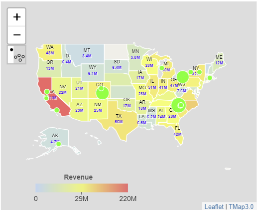
Outlier analysis in the TMap Visual can help identifying the best performers and/or the worst performers for shops or branches across a vast geographic region. When outliers are shown on the map, analysts or decision-makers can dig into them to find why some locations perform really well and some perform really bad, and use these insights found in this process to improve whole performance for a company.
The following example shows annual revenues for each store in a fast food company on a map. Digging into details for thousands of stores will need huge efforts and time and almost be impossible, and also the view is not good because symbols on the map are so crowded.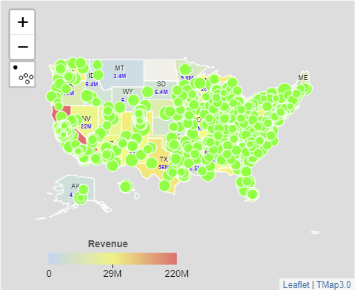
You can go to Microsoft AppSource to download TMap Visual and try it.